There’s frustration in the design world about RGB color mode and CMYK color mode. A design looks great on your computer, but suddenly looks dull and muted when printed. What gives? RGB is the color profile used by computer monitors to display images. But, printers use CMYK, which has a more limited range of colors. That can lead to unwanted surprises when looking at your printed product. Is there a solution here? Can you convert RGB to CMYK without losing color?
You cannot convert between RGB and CMYK without some amount of color difference of some sort. It’s a good idea to do test prints of your work with a high quality printer to see how your colors turn out. Also, talk with your print provider to see if they have suggestions given their knowledge of their own printers and how they manage colors.
It takes some extra steps and effort to make sure that your RGB designs print as well as you’d like them to in CMYK. And that’s where the frustration comes from.
You’ve spent so much time creating and perfecting your design in the first place, and now you have to exert all of this effort just to make sure it prints the way that you designed it in the first place?
Yeah, I get it.
But, it’s a reality of the design world, so we might as well learn to deal with it as best we can. To begin with, we’ll talk about the basics of RGB and CMYK color profiles. Then, we’ll dive into some tips for printing your art given the RGB vs. CMYK issue.
What is the difference between CMYK and RGB colors?
CMYK is used for color printing and is a subtractive process, which means that new colors are created when light is absorbed and you get closer to black. RGB is used for displaying colors on a screen and is an additive process, which means that the more colors you add, the closer you get to white.
Because CMYK and RGB work in such different ways, they can never be exactly alike and produce 100% identical results. Think about the differences between a computer screen and a piece of paper.
In the same way that everything we do with a computer functions differently than everything we do with paper, colors are the same. They are very different.
RGB and CMYK even differ in how many colors they can produce.
Which has more colors RGB or CMYK?
RGB can produce a wider range of colors than CMYK. This means that, no matter how hard we try, some colors that we produce on our screens in RGB cannot be reproduced in printed work because they don’t exist in the CMYK world.
This is especially obvious with neon colors, which can be produced in RGB, but not in CMYK. CMYK simply can’t mix colors in a way to make neons (source).
RGB simply has more to work with than CMYK.
If you want a great resource and way to navigate the RGB and CMYK worlds a bit more easily, check out this website. It has a lot of helpful lists and charts that lay out various color shades, both in RGB and CMYK. It’ll also tell you the equivalencies between RGB codes and CMYK codes. Very useful.
Alright, now that we’ve covered the basics of RGB and CMYK color profiles, let’s talk about why this all matters to begin with – printing.
Start with Printing in Mind
If you have a design in an RGB color profile, do some test prints and talk with your printer before forging ahead with making conversions to CMYK. This can help you understand what you need to do with your art to get the best results.
It’s easy to get caught up in the technical aspects of what “needs” to be done when, in reality, we just want our art to print well. Personally, I don’t care if my art is in a unicorn fairy wizard color profile as long as it looks good when I print it.
I get a lot of emails about color profiles and it seems like we’re overcomplicating things. So, let’s get back to basics and remember that we’re just looking for some awesome prints.
If you’re working with a printer, ask them what they suggest!
If you’re printing something with a lot of vibrant colors, printing on apparel, or just unsure of what to do, you want to connect with your printer to get their suggestions for getting the best end result with your colors.
Your print provider is a great resource. They print stuff all day!
If you’ll be printing at home, do some test prints with your own printer.
The people who work for printer manufacturing companies are smart cookies and are very aware of this issue of colors printing differently than they appear on the screen. So, they’ve made printers that try to address that and deal with RGB color profiles.
If you have a cheap printer that was primarily meant for students or professionals needing to print a lot of black and white forms, you might notice a bigger issue with printing colors. You get what you pay for.
Instead, if you have a higher quality printer that’s designed to print photos and color documents, you’ll probably have better results. You may even find that the results are as good as you need them to be.
A lot of cheap printers use the standard CMYK colors, which are cyan, magenta, yellow, and black. But, if you buy a higher quality photo printer, they’ll often have additional colorants that the printer can use to better match the colors on your screen.
This is why photo printers have been so successful. They probably wouldn’t have survived if they were always printing discolored prints of everyone’s family vacations. No, photo printers print really well, which means they’ve done a good job of accommodating for the CMYK color issue.
If you want to get better print colors without the fuss of messing around with your colors a lot, invest in a good photo printer that’s designed for printing in color.
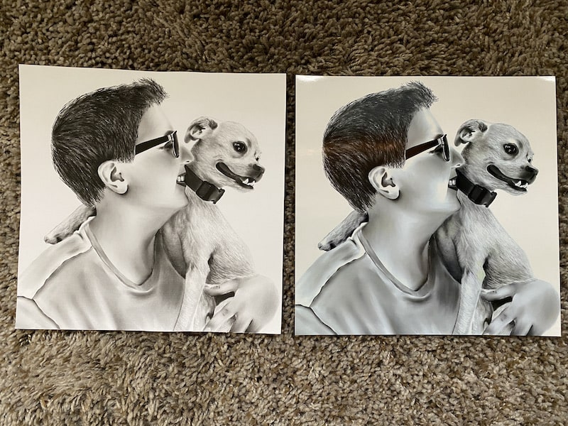
Once you have a high quality printer, it’s also important to have high quality paper. If you’re looking for bright colors, get bright white paper that isn’t off-white or dull in any way. Glossy photo paper is a great choice. This will go a long way in making sure that your colors pop off the page. But, matte card stock works well too.
In fact, I use matte card stock a lot when printing my work. I used to get weird results with photo paper and actually liked how my work printed on card stock. Who would have thought? That’s why experimenting is important!

Part of the problem with looking at colors on a screen vs. a piece of paper is that screens are inherently bright. They have the upper hand in making images pop. If you print on a dull piece of paper, no wonder it will look inadequate in comparison.
Buying high quality paper and a high quality printer that understands how colors work will always be a great way to combat the issues you have matching your screen colors to your print colors. That said, it will never be perfect. Modern printers have gotten extremely close, but the realities of how RGB and CMYK work mean that it will never be perfect.
Another thing to think about is whether your printer is appropriately calibrated to your computer. Do a search for your printer on Google if you’re not sure how to do this.
When your printer is properly calibrated, it will be better able to match the colors on your screen with the colors in your printed design. Calibration and color matching is something that the printer world really cares about. I mean, printing well is the whole point of a printer. In fact, there are a lot of inventions that are trying to improve a printer’s ability to do this very thing (source).
Then, do some test prints and see what you think. Are you happy enough with the results that you don’t need to worry about converting your art from RGB to CMYK? Does your print provider have a preference on how you send them the file?
If you understand what your art looks like when printed as is, plus what your print provider expects, you can save yourself a lot of time and stress trying to figure out how to deal with the RGB vs. CMYK issue.
How to Convert RGB to CMYK
If you need to convert your art from an RGB color profile to a CMYK color profile, begin by making a copy of it so that you have the original if you need it. Next, talk with your printer to understand how and why you’re completing the conversion. Photoshop is a great program to use for RGB to CMYK conversions.
I’m a huge fan of backing up and saving my artwork. If you’re going to convert your art to a different color profile, make sure you have your original art file stored somewhere. That way, if something goes wrong, you still have the original you can use.
Then, talk to your printer. I know we’ve talked about this, but it’s worth repeating. If your printer is asking you to convert your art from RGB to CMKY, get more details about any specific requirements they have for that.
What program do they recommend? Do they have specific steps that would work best for them?
You don’t want to convert your work, only to find out it’s not what they’re looking for.
Alright, and then we come to the conversion process. Photoshop is a great program to use for this. Th
There are also online converters. Personally, I would only use these to get a sense of what your design would look like when converted. Photoshop would be my choice for doing the actual conversion.
You can find a simple RGB to CMYK converter on Google. Here’s an example of what you’ll see when you run your design through a converter.


Until we learn how to produce web colors in a different way, the discrepancies between RGB and CMYK will always be an issue. Luckily, with the right knowledge, printer, and paper, you can equip yourself with the tools you need to avoid color disasters and end up with beautifully printed results.
Go forth and create great art!


Diana has been an artist for over 27 years and has training in drawing, painting, digital drawing and graphic design. Diana’s latest obsession is digitally drawing with Procreate and Procreate Dreams. Diana has experience selling her art across a number of platforms and loves helping other artists learn how to make money from their art as well.