Whenever I open Procreate to make a new piece of art, I’m always so tempted to pick a canvas and get to the fun part of creating art.
But, then I remember to slow down. Spending a few minutes to make sure my canvas is correct before I get started is SO important! I’ve learned that being intentional with my canvas setup can save me headaches down the road.
Here are 4 mistakes that I’ve learned to avoid when creating my digital art canvases!
1. Designing Your Canvas without the End in Mind
We don’t always know what we want to do with our art before we create it. Personally, I don’t know how many times I can barely think of my first shape, let alone the final product.
That said, it can be helpful to have a general goal for the piece of art so that you can set up the canvas accordingly. If I was going to make a wall tapestry, the canvas would need to be different from a 4×6” print.
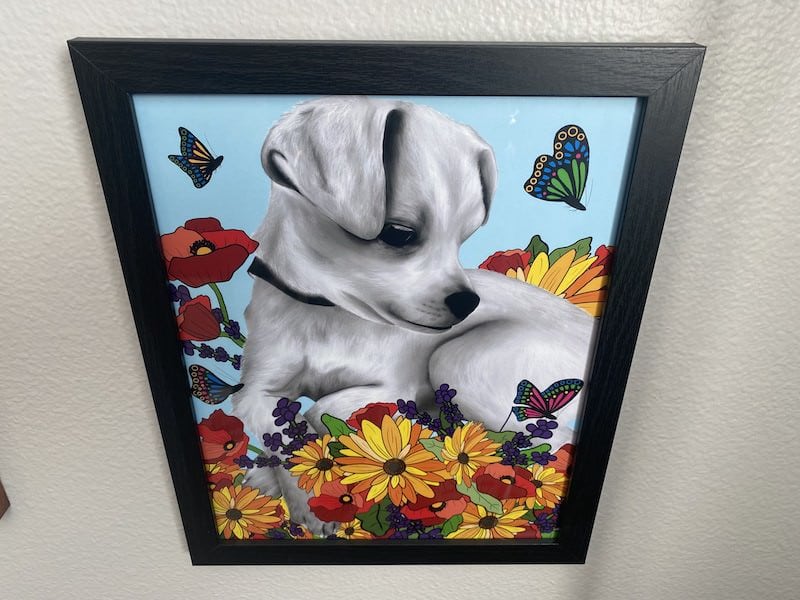
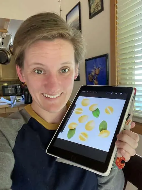
For example, when I designed this piece of art, I started off with a canvas that was 11×14″ because that was the size I decided I wanted to have it printed at.

Consider the important design elements that may impact the sizing.
Will my design be horizontal? Vertical? Square?
Is it going to be a repeating pattern? Something that uses the symmetry tool?
Again, you may not know everything about your work before you get started, but the more you can figure out, the easier it will be to set up your canvas accordingly.
2. Choosing the Wrong Canvas Size
Mistake #1 leads into mistake #2 because having an idea of what your art will become is very helpful for determining your canvas size.
If you’re using a raster-based program like Procreate, scaling your art up or down can lead to pixelation issues. If you design your canvas for a 4×6” print, but want to scale it up to a tapestry, it’s unlikely that it will look good.
So, even when I have no idea of where my piece of art will end up, I at least try to decide on the sizing.
And, when in doubt, I size up. It’s easier to take a large canvas and scale it down than to take a small canvas and scale it up. It’s still better to get the canvas size correct, but that’s a principle I personally use when I’m unsure of my sizing.
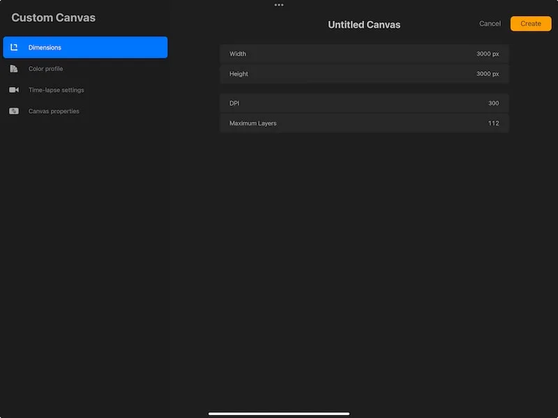
Here’s a chart that you can use to understand pixel to inch conversions for your canvas sizes. These are based on 300 DPI, which we’ll talk about in the next section. If you want to do your own calculations, or have a different canvas size you need to calculate, here’s a pixel to print converter.
3. Forgetting About DPI
DPI stands for dots per inch, which tells us how many dots of color are put into 1 inch of an image. This is important to keep in mind because choosing a DPI that is too low can result in blurry and pixelated prints.
For print images, the standard DPI is 300. Personally, I set all of my art to 300 DPI without another thought. If you think you have a reason to go beyond 300 DPI, it’s a good idea to talk to your printer and get their recommendation.
When setting up your canvas, don’t forget to check your DPI settings. Changing your DPI after your canvas has already been created can be problematic, so it’s ideally to set it prior to getting started.

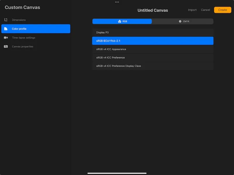
4. Getting Fancy with the Color Profile
In Procreate, you have the option to choose between RGB or CMYK color profiles. Personally, I don’t worry about this. RGB is where Procreate shines, so that is what I go with. It’s also the default in Procreate.
If you don’t understand color profiles and try to get fancy with them, you may end up with unexpected results. If you want to use different color profiles, make sure to experiment with them and understand how they will look, print, and function before going forward.
The RGB color profile is used by screens to display images, while the CMYK color profile is what printers use when printing images.
The RGB color profile has access to more colors than the CMYK profile. In the digital world of RGB, there are SO many colors that can be used, while printers can only hold so many colors. I personally find that printers do a fairly good job of compensating these days, but it’s always a good idea to experiment with printing to make sure your colors look as you intend them to.
So, why do I stick with RGB? Procreate doesn’t have a “true” CMYK. It’s actually based on RGB, which further complicates the color profile story.
This is why I stick with the RGB default when I personally create my art.
I have a full article on Procreate’s CMYK and RGB color profiles if you want to learn more!

Creating your digital canvas isn’t always the most fun part of creating art. It can feel more technical than creative. That said, it’s such an important part of laying the foundation for your future artwork. I hope that keeping an eye out for these mistakes can help you create the right canvas for your next masterpiece!
Diana has been an artist for over 27 years and has training in drawing, painting, digital drawing and graphic design. Diana’s latest obsession is digitally drawing with Procreate and Procreate Dreams. Diana has experience selling her art across a number of platforms and loves helping other artists learn how to make money from their art as well.